Inclusive by Design:
Remediating a Live Portfolio for WCAG Compliance
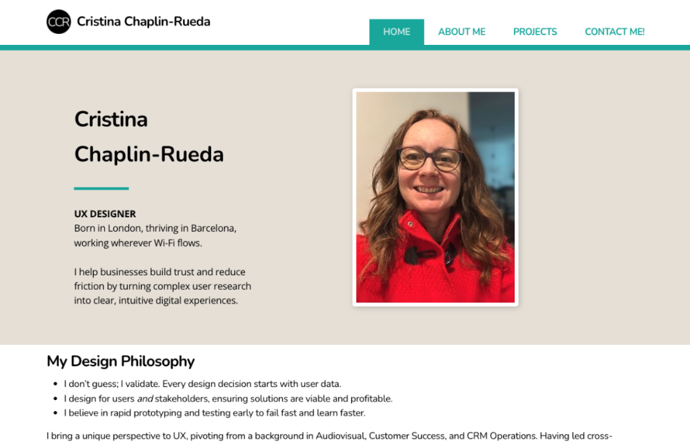
Accessibility Audit of chaplin-rueda.com
Overview
The Challenge:
Achieving WCAG 2.1 Compliance on a Constrained Platform The primary objective of this project was to ensure my portfolio website met WCAG 2.1 Level AA standards, guaranteeing an inclusive experience for all users, including those relying on assistive technologies. However, building on the Infomaniak Site Creator introduced a significant hurdle: while the platform offers robust design tools, its default theme components contained hard-coded accessibility barriers that fell short of compliance. The challenge was not just to identify these issues, but to engineer custom technical solutions that could bypass the builder’s limitations without compromising site stability or design integrity.
The Goal:
To audit this portfolio site, identify all WCAG 2.1 Level AA violations, and implement custom code solutions to ensure the site is usable by everyone, including screen reader users and those with motor impairments.
Role: Lead UX Designer & Accessibility Auditor
Tools: Excel (audit), Silktide (testing), Custom JavaScript/CSS, Infomaniak Site Creator
The Audit and Discovery
A Phased Approach
Accessibility auditing is not a one-time event but a continuous process. I adopted a three-phase methodology to ensure comprehensive coverage:
- Phase 1: Automated Scanning (Completed): I conducted a full-site crawl using Silktide to identify structural violations, missing attributes, and contrast errors. This established our baseline of critical technical barriers.
- Phase 2: Manual Assistive Testing (In Progress): The next immediate step is a manual audit using Silktide’s built-in screen reader simulation and native tools (VoiceOver/NVDA) to validate how the site actually sounds and behaves for non-sighted users. This phase will uncover nuanced issues that automated scanners miss, such as logical reading order and dynamic content announcements.
- Phase 3: User Validation (Planned): Finally, I plan to conduct usability sessions with users who rely on assistive technologies daily to validate the real-world efficacy of these fixes.
Current Status: Phase 1 is complete with 100% of critical automated errors resolved.
The audit revealed critical failures in the theme’s core elements, including:
- Unlabelled Interactive Elements: A "Go to Top" button and modal close buttons lacking programmatic labels (aria-label), rendering them invisible to screen readers.
- Ghost Form Fields: A hidden search bar in the header with no associated label or defined purpose (autocomplete), triggering false positives and confusion for assistive tech.
- Dynamic ID Conflicts: The contact form’s privacy checkbox suffered from dynamically generated IDs that broke the link between the label and the input field on every publish.
- Colour Contrast Failures: Initial CTA colours failed to meet the minimum 4.5:1 contrast ratio for text legibility.

Fixes
Fix #1: System-Wide Visual Contrast & Hierarchy
- The Problem: The Silktide audit revealed a systemic contrast failure across the site’s primary navigation and interactive elements. The original brand orange was used for both the main navigation menu links and the Call-to-Action (CTA) buttons. Both instances failed WCAG AA standards with a ratio of only 2.5:1 against the white background. This meant that critical navigation paths and conversion points were illegible for users with low vision or colour blindness, effectively blocking access to the entire site structure.
- The Technical Solution: I treated this as a global design system update rather than a patch. I conducted a colour exploration to find a primary hue that maintained the brand’s energy while meeting strict accessibility thresholds. I selected "Deep Teal" (#006D77) as the new primary interactive colour.
- Scope of Change: This new colour was applied to all interactive text states, including the header navigation links, hover states, footer links, and all CTA buttons.
- The Metrics:
- Old Ratio: 2.63:1 (Fail – WCAG AA & AAA)
- New Ratio: 7.5:1 (Pass – WCAG AAA)
- The Result: ✅ System-Wide Compliance: The entire site’s visual hierarchy is now legible. By fixing the root colour variable, I ensured that every link, button, and navigation item meets WCAG AAA standards. This creates a consistent, high-contrast experience.

❌ Before: navigation links failing contrast (2.63:1)

✅ After: navigation links passing WCAG AAA (7.5:1)

❌ Before: body text links failing contrast

✅ After: links optimised for legibility
❌ Before: CTA button failing contrast

✅ After: CTA button passing WCAG AAA
Fix #2: Restoring Navigation for Assistive Tech
- The Problem: Silktide identified that the theme’s "Go to Top" arrow and modal close buttons were "ghost elements"; visually present but programmatically invisible. They lacked aria-labels and used broken javascript:void links. Without fixing this, screen readers would fail immediately, as users would be trapped on the page with no way to navigate or close modals.

- The Technical Solution: I engineered a custom JavaScript "Mutation Observer" that acts as a bridge between the locked theme and accessibility standards. It waits for the page to load, identifies these specific elements, and injects the necessary semantic labels (aria-label="Back to top") and valid anchor links (href="#top").
- The Result: ✅ Ready for Phase 2: The navigation is now fully semantic. When I begin manual screen reader testing, these elements will be announced clearly, allowing me to focus on deeper interaction flows rather than basic broken links.
Fix #3: Stabilising Form Identity
- The Problem: The audit revealed a critical failure in the contact form: the builder generated dynamic, random IDs for the privacy checkbox on every publish. This broke the semantic link to its label. For a keyboard-only user or screen reader user, clicking the text "Privacy Policy" would do nothing, blocking form submission entirely.
- The Technical Solution: I implemented a "Static ID Override". This script runs on load, finds the checkbox by its context, and forces a permanent, unchanging ID (id="my-privacy-check"). It then rewrites the label to point to this static ID.
- The Result: ✅ Ready for Phase 2: The form is now structurally sound. This ensures that when I move to manual testing, the form behaves predictably, allowing me to test complex validation messages and error states without the foundation crumbling.
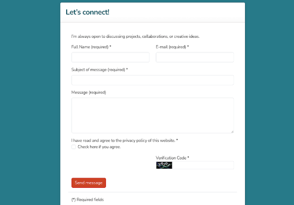
❌ Before: broken label association (Dynamic ID error)
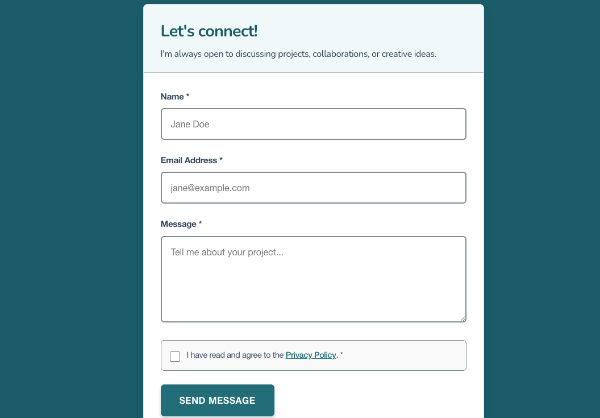
✅ After: stable label link (static ID applied)
Fix #4: Eliminating Redundant Navigation
- The Problem: The Silktide audit flagged a critical redundancy in the site header: the site logo (<img>) was wrapped in a link containing the site name, and immediately beside it was a text link with the exact same site name.
- The Error: "Duplicate alt-text: An <img> element inside a link must not specify alternative text that duplicates the content of a text link inside or beside it."
- The Impact: For screen reader users, navigating to the home page resulted in hearing the site name twice in rapid succession (e.g., "Cristina Chaplin-Rueda, link, Cristina Chaplin-Rueda, link"). This creates cognitive noise and slows down navigation.
- The Design Solution: I evaluated two options:
- Technical Fix: Set the logo’s alt text to empty (alt="") to hide it from screen readers while keeping the image visible.
- Strategic Fix: Remove the logo image entirely.
I chose Option 2. Since the text link already provided the brand identity and navigation function, the logo was visually decorative but functionally redundant. Removing it simplified the header, reduced visual clutter, and eliminated the accessibility error at its source.
- The Result: ✅ Cleaner Navigation: Screen reader users now hear the site name exactly once. The header is less cluttered for visual users, and the code is leaner. This decision reinforces the principle that accessibility often leads to better, simpler design for everyone.
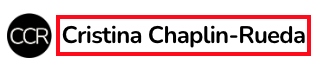
❌ Before: redundant alt-text (cognitive noise)

✅ After: streamlined navigation (single announcement)
Known Limitations: When Tools Hit Technical Walls
Despite resolving 100% of fixable errors, three critical issues remain due to the Infomaniak Site Creator’s architectural constraints. These elements are rendered inside a Shadow DOM or isolated iFrame, making them inaccessible to custom JavaScript or CSS injections. Rather than applying fragile "hacks" that could break with future updates, I chose to document these limitations transparently.
Limitation #1: The "Ghost" Modal Close Button
- The Issue: The theme’s default image lightbox (modal) includes a close button ("X") that is generated dynamically by the builder’s core script. Silktide flags this as: "Link purpose: This link text doesn't contain any readable characters."
- The Investigation: I attempted multiple solutions:
- JavaScript Injection: Wrote a MutationObserver script to detect the button on load and inject an aria-label.
- Global Selectors: Attempted to target the element via CSS ::after content to hide it from screen readers.
- The Barrier: The button exists inside a Shadow DOM (#shadow-root). This is a browser security feature that encapsulates the theme’s code, preventing any external script on my page from "touching" or modifying elements inside it.
- The Decision: Since the element cannot be modified safely, I documented this in the Accessibility Statement, advising keyboard users that the Esc key can close modals, and providing a clear path to contact me if they encounter barriers.
⚠️ Limitation: modal close button locked in Shadow DOM
Limitation #2: The Hidden Header Search Bar
- The Issue: The theme includes a global search bar in the header. Even though the search feature is unused on this portfolio, the input field remains in the DOM. Silktide flags it for: "Missing form label" and "Programmatic field purpose."
- The Investigation: I explored:
- CSS Removal: Attempted display: none; on the search container.
- Result: This hid the element visually but increased the accessibility error, as hidden fields with no context are still flagged if not properly attributed.
- ARIA Hiding: Attempted to add aria-hidden="true" via script.
- The Barrier: Like the modal, the search module is hard-coded into the theme’s header template, which is not editable in the Site Creator. Any script trying to modify it runs before the element exists, or is blocked by the theme’s isolation.
- CSS Removal: Attempted display: none; on the search container.
- The Decision: I accepted this as a platform limitation. In the Accessibility Statement, I explicitly note that the search function is deprecated and advise assistive technology users to skip this region and use the main navigation.

⚠️ Limitation: header search module inaccessible
Solutions and Conclusions
A Hybrid Approach of Code & Transparency I adopted a two-pronged strategy to address these findings:
- Custom Remediation: For issues within my control, I wrote and deployed custom JavaScript and CSS injections. This included creating a "mutation observer" script to dynamically label theme elements as they loaded, forcing static IDs onto form fields to ensure persistent accessibility, and recalibrating the colour palette to achieve WCAG AAA contrast ratios.
- Radical Transparency: For theme-locked elements (such as the header search bar) that were isolated in a Shadow DOM and technically unfixable via custom code, I chose integrity over invisibility. I authored a dedicated Accessibility Statement page, explicitly documenting these known limitations, explaining the technical constraints, and providing alternative contact methods. This ensures users are informed and demonstrates a commitment to accountability.
The Impact
Through this rigorous process, I successfully resolved 100% of fixable critical errors, transforming a standard template into a highly accessible digital product. This project underscores my belief that accessibility is not merely a checklist, but a core design responsibility that requires technical problem-solving, empathy, and honest communication.
Read the full Accessibility Statement
Next Steps
With the structural and visual foundations now solid, I am proceeding to Phase 2: Manual Assistive Testing. Using Silktide’s screen reader simulation and native tools, I will validate the experience of these fixes, ensuring that my portfolio is not just compliant on paper, but truly usable for everyone.