Wanderlust Airlines - Case Study
Overview
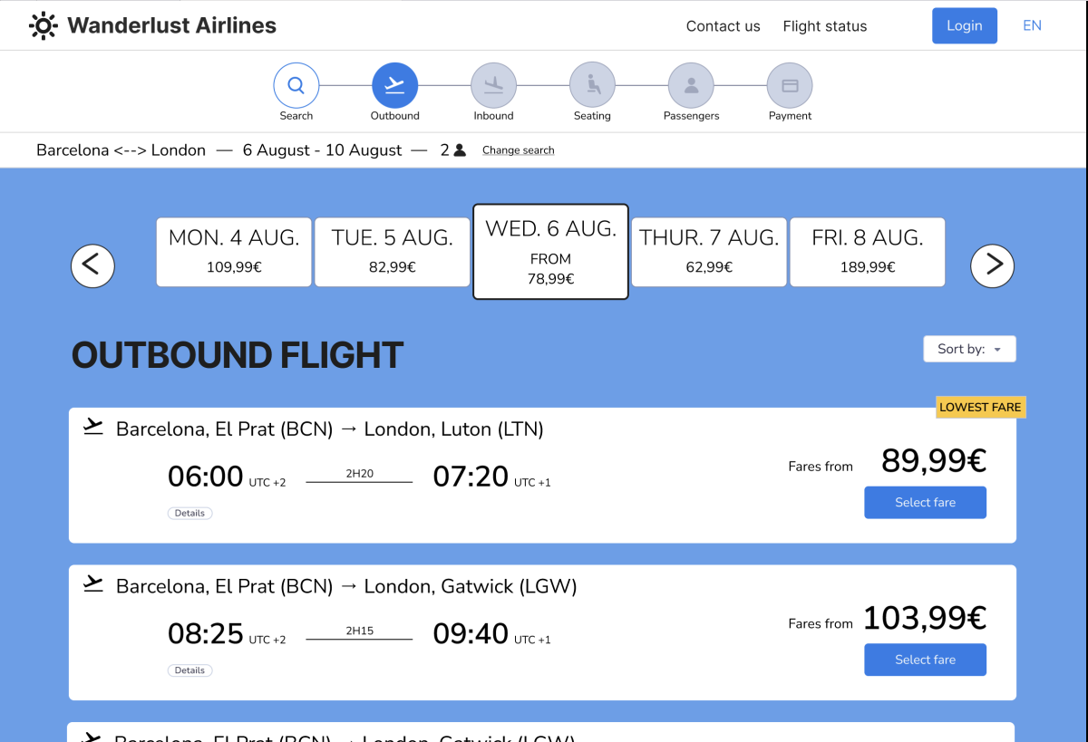
In the highly competitive airline industry, complex booking flows and hidden fees are primary drivers of cart abandonment. What was needed was a digital experience that not only simplified the user journey but also rebuilt trust. The challenge was to redesign the booking flow to address critical pain points while still meeting business revenue goals.
Strategic Value:
This project demonstrates the ability to align diverse stakeholder interests: balancing the business need for ancillary revenue (upsells) with the user’s demand for transparency. By leading research that spoke to both technical constraints and user psychology, the resulting design offers a linear, trustworthy journey that reduces friction and encourages booking completion.
Industry Context & Research Strategy
The airline industry faces a common challenge: balancing the need to present diverse fare options and ancillary services with the user’s desire for a simple, transparent booking journey. To design a competitive alternative, it was essential to first understand the standard conventions users expect versus the frustrations they endure.
I undertook a multi-method research approach (benchmarking, surveys, and interviews) not just to gather data, but to identify the specific emotional triggers causing users to abandon their carts. This research became the blueprint for every subsequent design decision, ensuring the solution was grounded in real user behaviour rather than assumptions.
Research Methods
The research I undertook included:
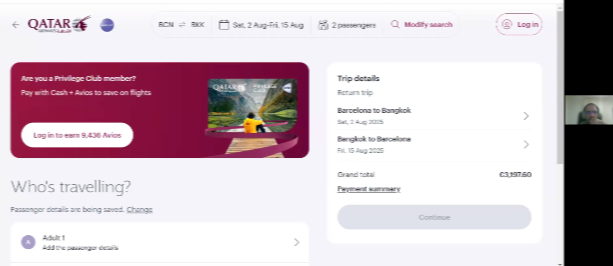
- Competitive benchmarking: Comparing four similar sites to examine each step of the booking process, from the homepage to the booking summary. This provided an overview of best practices to adopt and those to avoid.
- User research via an online survey: Designed to understand the experiences and opinions of diverse users when interacting with airline websites.
- Usability testing via in-depth interviews: A deep dive into individual user experiences to gain a concrete understanding of every step within the customer journey.
Analysis and Conclusions
The competitive benchmarking research provided insights into the conventions of existing airline sites. I included a train reservation site in the study, to provides insights into a travel-related ticketing service from a different perspective. The research provided insights into which elements were valuable to replicate and those areas to improve for a better user experience.
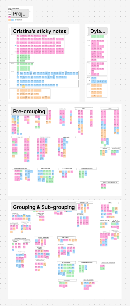
We created a board with all our notes, then arranged, and rearranged, the notes into groups that we noticed emerging.
- Having both outbound and inbound flights on the same page was confusing.
- Both outbound and inbound flight pages should be clearly titled to clarify page user is on.
- Lack of clarity in fare options was a common pain point.
- A common user feeling was a mistrust of upsells and add-ons.
- They also showed a repeated desire for more transparency and linear booking steps.
Concept development
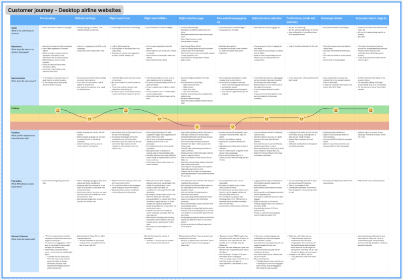
Customer Journey map
User Flow & Strategic Pivot
Progressing from the journey map, I mapped the screen flow to define the information architecture. However, during this process, it became clear that a standard linear flow would not fully address the user's demand for transparency.
To bridge the gap between research insights and the final interface, I identified three critical areas where the standard flow needed to be disrupted:
- Challenge: Users felt misled by costs appearing late in the process.
- Strategic Shift: Move luggage add-ons from a later step into the Fare Selection Modal.
- Challenge: Forced account creation caused friction for users merely researching prices.
- Strategic Shift: Delay account creation until post-payment and introduce a 'Speedy Check-out' path.
- Challenge: Confusion between outbound and inbound selections.
- Strategic Shift: Clarify page titles and unify the selection logic.
These strategic decisions directly informed the subsequent wireframing stage.
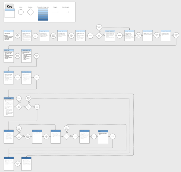
Figure 1: The revised logical user flow incorporating the strategic shifts.
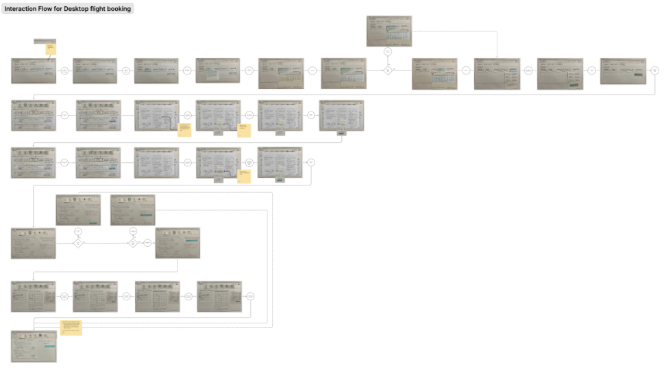
Figure 2: End-to-end wireframe screen flow showing the new linear progression.
With these strategies in place, I began sketching the wireframes. This was where the solution for the fare modal truly crystallised. As one user had stated during research, 'I would like more transparency about offers... from the start.'
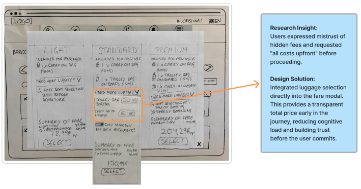
Why integrate luggage into the fare modal?
During research, users repeatedly expressed frustration with opaque pricing:
“I would like more transparency about offers and process of booking ordinary tickets from the start.”
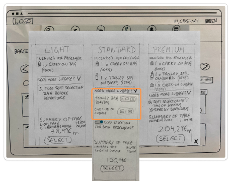
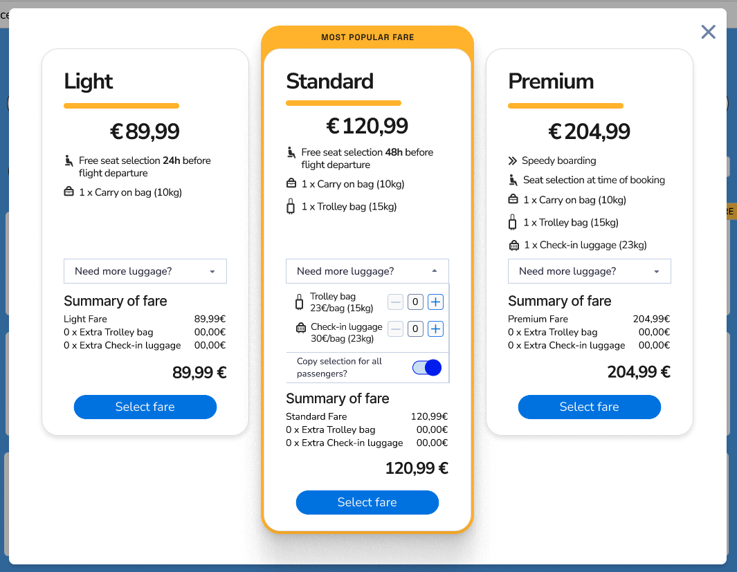
By moving the luggage add-on into the fares modal, the design provides an accurate fare summary before the user proceeds to secondary screens like seat selection. This reduces the number of clicks and cognitive load, giving users a greater sense of control and transparency. Consequently, users are more likely to continue their journey through to payment, directly addressing the issue of cart abandonment.
The Account Creation & Speedy Check-out Solution
Another pain-point solution came from knowing that many users often research flights before buying. I moved the account creation step to a later stage in the journey. The strategy was to increase trust by making the process feel less pushy and allow users to see the real total trip price before deciding.
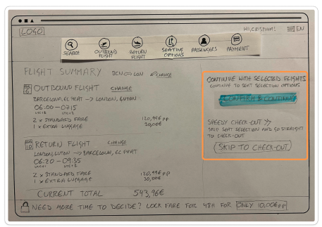
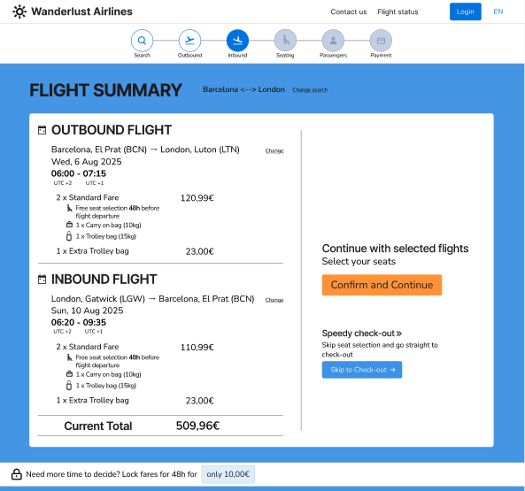
To further iterate this point, I also introduced a “Speedy check-out” option for users who don’t want to pay for seats, letting them skip directly to payment. The intention with this was to streamline the flow, reduce clicks, and lower basket abandonment while still allowing post-payment seat upgrades.
To align with business goals, the CTA hierarchy prioritised seat purchases, giving the “Speedy check-out” button lower visual weight.
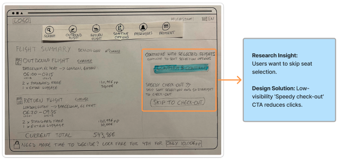
Design
Prototype & Wireframes
Evolution of the Fare Modal:
The structural decision to integrate luggage (figure 1, left) was enhanced with clear visual hierarchy and accessible colour contrast in the final design (figure 2, right).
Evolution of the Fare Modal:
The structural decision to integrate luggage (figure 1, left) was enhanced with clear visual hierarchy and accessible colour contrast in the final design (figure 2, right).
Conclusion and Reflection
- Simplified booking flow with grouped fare and luggage options
- Improved user trust with transparent pricing, resulting in a faster flow to payment